FYI: I earn a small commission from some links and advertisements.
Acrylic Painting Lesson 8: Understanding light, shadow, and planes
The goal of the eighth lesson is to understand how light and shadow can show planes and create a dimensional effect.
It has been awhile since I painted again. Another rainy day had me eager to paint.
My excuse this time is that we have been redoing the front yard with a permaculture design and native plants. I will share more about that later when I have some "after" photos. Right now the baby plants need to grow.
Environment Today
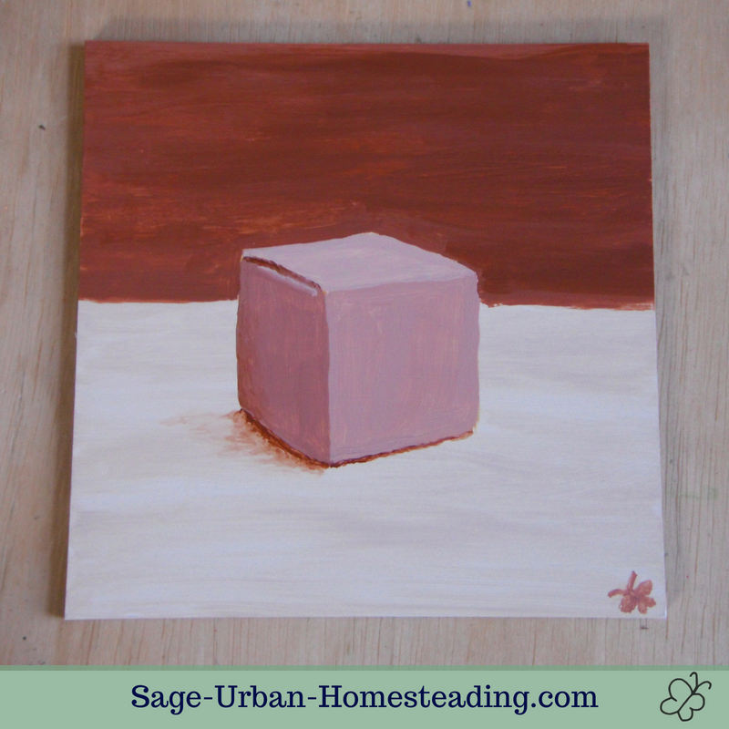
No ants today, so I was back in my usual painting spot. I still have everything very quick to set up. There were some annoyances from the young artist, but mainly she was interested to watch me mix the colors. I explained to her about the sides of the box being lighter and darker to show shadows and dimension.
I had to keep it quick while fixing lunch. My painting session ended quicker than I might have chosen because other things demanded attention, but sometimes that is better than wasting time fiddling on unimportant details.
Subject Matter for Light, Shadow, and Planes
I was not thrilled with the box, but I understand the importance of a lesson in values and dimension. I have done many cube sketches in pencil and charcoal in my art classes but none in acrylic paint. The hardest part was the straight lines, especially the divided horizon line. I switched from a #8 round brush to a #5 round to do the shadow lines and details.
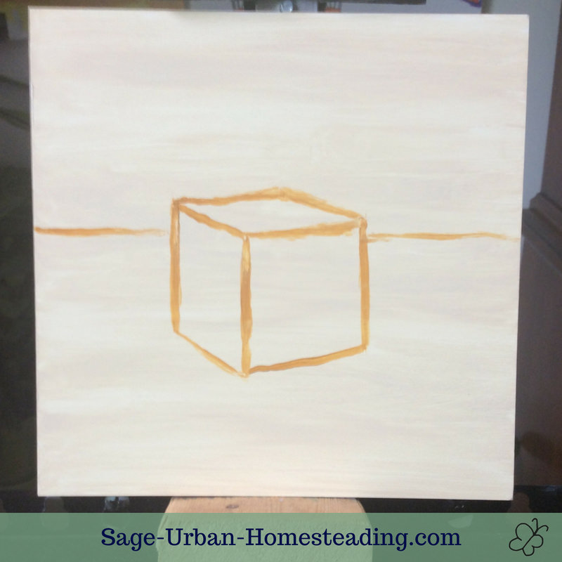 Painting in progress, on the easel
I don't understand why the author paints the background last on something like this. I left the foreground same color it was all initially painted. What was the point of painting that light coat if you are going to cover it up? It makes sense to me for the darker color to be painted last to not have it show through. I understand that from watercolors.
It was difficult for me to get it to look like one flat color. Some paint lifts from board on each stroke. Maybe that is a sign that I need to use more acrylic medium. I actually ran out of the dark background color and needed to finish up fast so I used some barely mixed burnt sienna, and it was good enough.
I hastily added my butterfly signature and the antennae turned out too thick. I discovered a new technique for wiping off paint with a clean damp bush. I was able to wipe off the extra and trim them to a decent size.
Status: Not for sale yet
Overall, this painting looks very brown, almost like a sepia image. I definitely would have mixed the colors a little differently if observing from real life or painting from memory. Maybe I do see more colors thanks to my college art teacher ("never paint a black shadow") but the final photo in the book looks like there is some black in the background and some ocher on the front side of the box.
